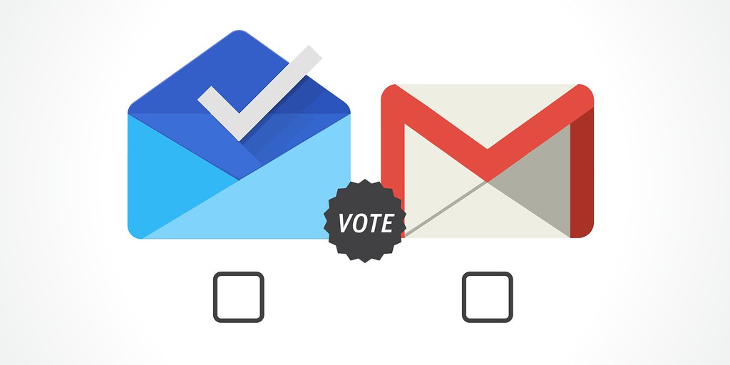
What’s the difference between the Gmail 5.0 and Inbox? Both were released at approximately the same time. Both look similar to each other, incorporating Google’s new vision of Material Design. Both can handle the same Gmail account. If they look and feel the same, why do you need to get both? Actually, do you need to get both?
You need to dig a little bit deeper if you want to see the differences between the two seemingly identical email apps. Upon opening both for the first time, an additional option in one sets them apart. Inbox will ask for your Gmail account details; standard for an email reader app. Gmail does the same, except, afterwards, it asks you if you want to link other POP3 mail clients to the app, thereby creating an integrated mailbox that links all your accounts, including Yahoo and Outlook. Inbox remains strictly Gmail.
The interfaces of the apps differ slightly, if you go beyond the same Material Design features. Gmail is a standard email client app wherein all the emails are listed down chronologically without any classification or packaging. Besides the curated folders created manually, what you see is what you get, which is basically just a list. Inbox, however, boasts its advanced cataloging system. Emails are bundled into updates, promos, forums, and the like. These are further divided chronologically.
Inbox offers a lot more options for your mail, besides the conventional read-and-delete. You can pin emails so they can be accessed quickly and easily. You can delete a whole bundle, rather than selecting them one by one. You can set them aside for later at a future time when Inbox will alert you again about your mail. While Gmail offers the usual (yet still useful) mail archiving into convenient folders, it pales in comparison to what you can do in Inbox.
Inbox also operates like Google Now, giving you the ability to set reminders for yourself of important things in the future.

So, we weren’t even pitting the two against each other, yet it looks like Inbox is ousting Gmail as the go-to email client app, at least if you remain Gmail-exclusive. So why consider Gmail?
For one, Inbox is available only through invites. It is not (yet) available for public consumption. You either have to request an invite from Gmail directly or by receiving one from a friend who has an invite. That, in itself, is a clue that Inbox is not for the everyday consumer.
Recently, Google shed light on how Google Inbox was born. Gmail developers were going for the Inbox model from the get-go to replace the old Gmail model. However, other employees at Google didn’t take kindly to the radical change in direction, because it had too much new features. The developers of Inbox argued that on average, Gmail users only get five emails per day, which are usually just promotional material that don’t require a reply. The dissenters at Google argued that it isolated the massive user base with its foreign features. As a result, a compromise was reached to separate the two apps. A group of developers would work on Inbox, while another would work on improving the current Gmail model, thereby ensuring the existence of both apps.
If you’re the type to receive important emails on a daily basis, it would be beneficial to keep to the new Gmail app. If you’re one of the many users who usually get promotional material every day, you will find Inbox a much more convenient option. Regardless of the split, you will find Inbox a revolutionary approach to curating and organizing emails into neat little bundles. Currently, I have both apps on my Android phone. While it may seem redundant, especially when it comes to notification alerts, Inbox is still a welcome addition to the app drawer, especially when sifting through a wave of promotional emails and pinning/keeping tabs on important emails. To supplement it all, I keep the Gmail app as my default all-around email reader. But I can’t wait for when all these different features are integrated into one convenient, little app. For now, I’ll keep both in coexistence with each other.


